So you’re designing a website layout, either for yourself or for a client, and you’re looking for some best practices and examples to follow.
Maybe you’ve even spent some time digging through templates for inspiration, because hey… it can’t hurt, right?
Wrong!
Website templates are great… but they can be drastically affected by stock photos, brand assets, colors, fonts, etc.
Before you start browsing templates, you first need to understand what your site needs to do, what content you’ll have, and how you need to lay it all out for an optimal user experience.
So how do you do that? Great question! Here’s my step-by-step process to designing a website layout with best practices:
Step One: Set Your Goals
A website is more than just a collection of pages. Really, it’s a roadmap for your audience. It helps them find what they’re looking for when they’re looking for it.
Which means before you start looking at templates and designs, you have to first understand what your audience needs from your site to begin with.
What’s the goal of your site? Is it educational? Is it selling products? Is it a resume site to help you get hired?
Before you can start navigating somewhere, you have to know the end destination. The same applies to your website. Before you even start planning the website layout, define the overall goal of the site.
What to Consider:
- Your website today doesn’t have to be your website tomorrow. Set your goals for what you want to accomplish right now.
- Your overall website will have a goal, and each page will have a goal. Separating the two can help you get clear on the overall flow.
- Your site is all about the user. What are THEY trying to accomplish?
What to Avoid:
- Biting off more than you can chew. If you’re trying to do too much at first, you’re either going to end up with a messy site or no site at all.
- Getting caught up in the nitty gritty. We’re not talking functionality, yet.
What to Learn:
Examples to Copy:
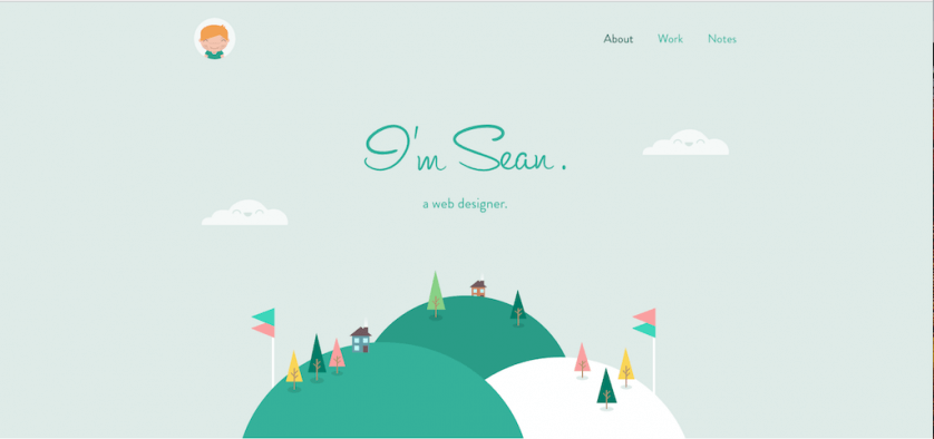
Sean Halpin
Sandy Springs Artsapalooza

Step Two: Map Out Your Main Content
Once you have the main goal of the website, you can start to think about what content you need.
What types of information is your audience searching for? How should that information be grouped?
This will become the overall architecture of your site (and the navigation). Remember, your site is all about your audience’s journey.
The end goal is to get them to the information they need in the fewest steps possible. It doesn’t matter how beautifully designed your website is if no one can find what they’re looking for!
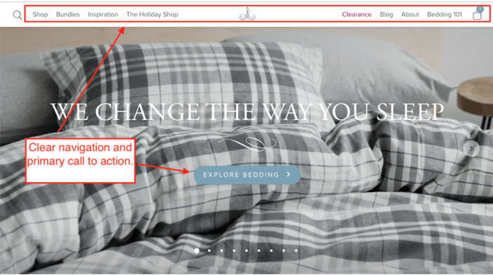
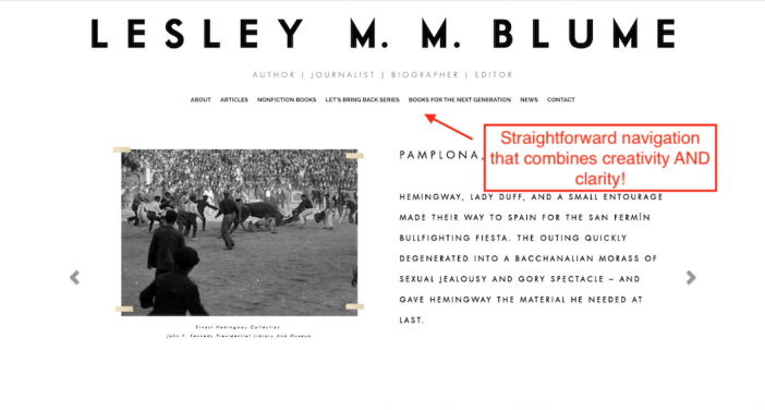
The key here is clarity. The navigation should be intuitive — your people shouldn’t have to dig for information.
Define your site’s primary navigation and content groupings before moving into design, so you can choose or design a template that supports an intuitive architecture.
What to Consider:
- Think about how a user who lands directly on a given page would feel (without having navigated from your homepage).
- Think about someone how has accessibility needs, or is simply in a hurry would feel.
- Again, less is more. If you don’t need multiple pages to say it, don’t use multiple pages to say it!
What to Avoid:
- Burying important pages in a deep hierarchy. Prioritize key information
- Death by content. Your website doesn’t have to be the final destination.
What to Learn:
Examples to Copy:
Au Lit Fine Linens
Lesley M.M. Blume
Step Three: Get your page layout down
I know, I know… it sounds counterintuitive to think about a layout before you start searching for a template. But again, this is all about organizing your information.
If you have an idea of the type of layout you need for each page, you’ll narrow down template options a lot sooner (and will be less distracted by frills that you probably don’t need anyway).
Again, the goal is to get people the information they need in the quickest way possible. Think about your own browsing behavior. You’re likely not reading each and every word on the site, right?
What to Consider:
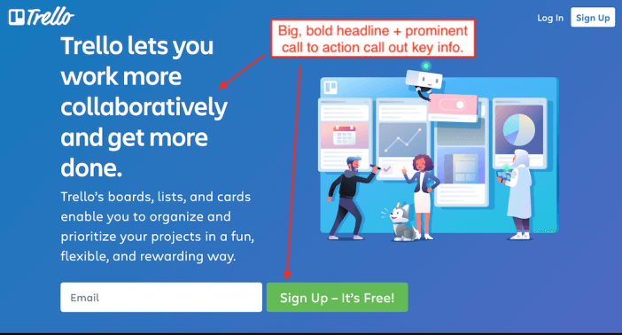
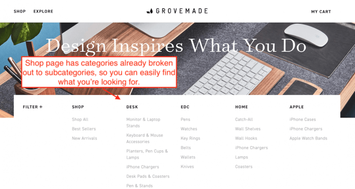
- Use size to distinguish between important info / details that may not be as crucial — the most important information should be the biggest on the page
- Use headers and subheads to help scanners find key sections + information
- Bold important phrases and key information
- Use bullets / icons to break up text-heavy sections (see what I did here?)
What to Avoid:
- Don’t sacrifice clarity for creativity
- Don’t bury key information “below the fold” (AKA don’t make people dig and scroll endlessly for it).
What to Learn:
If you want a page-by-page breakdown, check out our guides on…
- Homepage best practices
- About Us page best practices
- FAQ page best practices
- Contact Us page best practices
- Product page best practices
Examples to Copy:
Trello
Grovemade
Step Four: Lock in functionality
After you have a general layout in mind for your pages, it’s time to think about functionality on each page.
When we’re dealing with website design, remember that sometimes less is more, especially if you’re just trying to get your site up and running.
Having a minimally viable website can be more effective than having some juggernaut with bells and whistles that confuses people or costs you a fortune to get up and running.
Think through the minimum functionality each page needs.
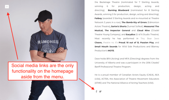
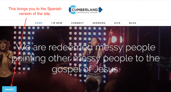
For example, your services page probably doesn’t need social media icons / social sharing. However, you may want to include links to your social channels on your Contact Page, or bring in your Instagram feed on your About page if it’s applicable to your overall site goals.
A well-designed website isn’t about how advanced the functionality is. It’s about how quickly and easily can you give people the key information they need to accomplish their goals on a certain page.
What to Consider:
- Think about the functions that would actually enhance your users’ experience.
- What functionality is a must-have right now, and what’s a nice-to-have down the line?
- Functionality isn’t built in a template — it’s supported by your software (AKA your website builder).
What to Avoid:
- Functionality for the sake of functionality. You don’t want to overload your site or confuse your users.
- Biting off more than you can chew. Having the ability to upload your latest YouTube episode is great, until you have to keep up with it.
What to Learn:
Examples to Copy:
Dave Horak
Cumberland Community Church
Step Five: Pick Your Template
So you’ve done the planning, you’ve sketched out your site, and you even know how the site needs to function. It’s time to finally, FINALLY start looking for a template (or creating your own)!
What to Consider:
- Templates are really just HTML and CSS… which means they can be recreated almost anywhere. If you see a Wix website example you love but want to use WordPress, you can easily recreate it.
- Keep your layout needs in mind that you defined earlier, and remember that most templates are fairly customizable.
- Look beyond the homepage. Look at how the subpages and unique pages are presented.
What to Avoid:
- Again, functionality is NOT something that comes with a template.
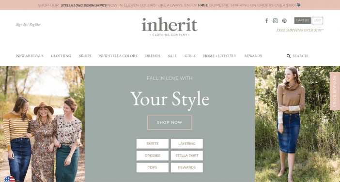
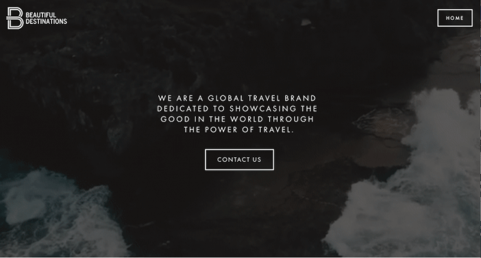
- Don’t judge a template based on the photography and logo designs. Often, a template will only look a certain way due to the mock-up creative assets.
What to Learn:
Examples to Copy:
Inherit Clothing
Beautiful Destinations
Next Steps
You’re all set! Just follow the step-by-step process outline above to design a website layout that’s clear, easy to navigate, and gets your users the right information at the right time!
Related Posts
- How to Build a Minimally Viable Website
- 404 Page Best Practices, Ideas, & Examples
- Contact Us Page Best Practices, Ideas & Examples
- Ecommerce Product Page Best Practices, Ideas, & Examples
- Effective About Us Page Design: Best Practices & Examples
- FAQ Page Best Practices, Ideas & Examples
- Homepage Best Practices, Ideas, & Examples
- Website Design Best Practices w/ Examples
- Thank You Page Best Practices, Ideas & Examples
- What Is A Web Design Color Palette and How Do I Make One?
- How Much Is A Website Per Year Explained
- 59+ Ways To Find Free Images For Commercial Use
- How to Improve Your Website Content
- How To Write A Meta Description For SEO
- How To Write A Title Tag For SEO
- Landing Page Best Practices w/ Ideas & Examples