Ah, the homepage. If you’re like most website owners, you’ve put massive thought into making your front page look amazing.
But there’s a rhyme and reason behind homepage design… at least, there should be. Your homepage likely attracts the most visitors of any page on your site. It’s the front door to the rest of your content — and the rest of your business online.
Think about your own browsing habits. What happens when you have a bad homepage experience on someone’s website? You likely hit the back button ASAP.
So let’s talk about getting your homepage where it needs to be. Here are five homepage best practices you should follow, from how your copy should be written to how to give visitors next steps (with examples)!
Your homepage should…
Highlight Who You Are and What You Do
For many (but certainly not all) visitors, your homepage is their very first interaction with you. This means it needs to answer these two questions immediately: Who are you and what do you do?
There should be no doubt in a visitor’s mind that they’re in the right place when they hit your homepage. If they can’t identify who you are and what you have to offer in a matter of seconds, they’re going to bounce (and probably head to your competitors).
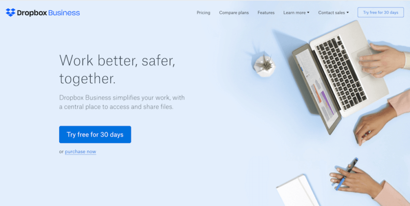
Who does it well: Dropbox
Vibe with Your Audience
There’s no point in dropping tons of bucks to design a homepage if it doesn’t resonate with your target audience — no matter how beautiful it is.
Your homepage should be all about your users, which means it needs to read the way they speak and have a design that gives off the right perceptions about your brand.
Keep your copy clean, straightforward, and rid of jargon that could confuse your audience. You’ll also want to make sure your design is clean, offers a great user experience, and gives off the emotions you want associated with your business.
For example, a bank may want to have a more professional feel and use colors that portray trust and reliability (like blue). In contrast, a doggy daycare may want to be more playful and fun and use bright colors, creative fonts, and animations.
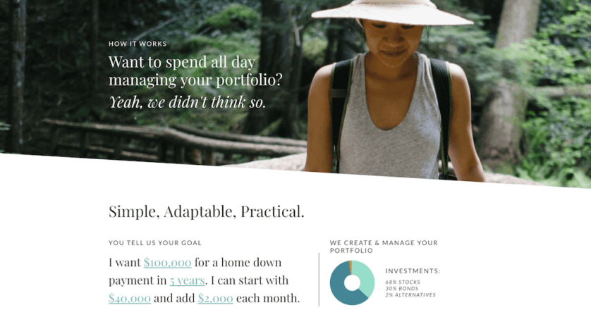
Who does it well: Ellevest
Help Users Find What They’re Looking For
While your homepage is a huge source of new traffic, most of the time your homepage visitors come to your site knowing what they’re looking for. Why not give it to them in as simple a way as possible?
Your website’s navigation should be clearly visible at the top of your homepage and have logical paths to guide users to the next step. You can also include a website search, which gives users direct access to exactly what they’re looking for without having to click through multiple pages (this can be especially handy for eCommerce businesses who have tons of products).
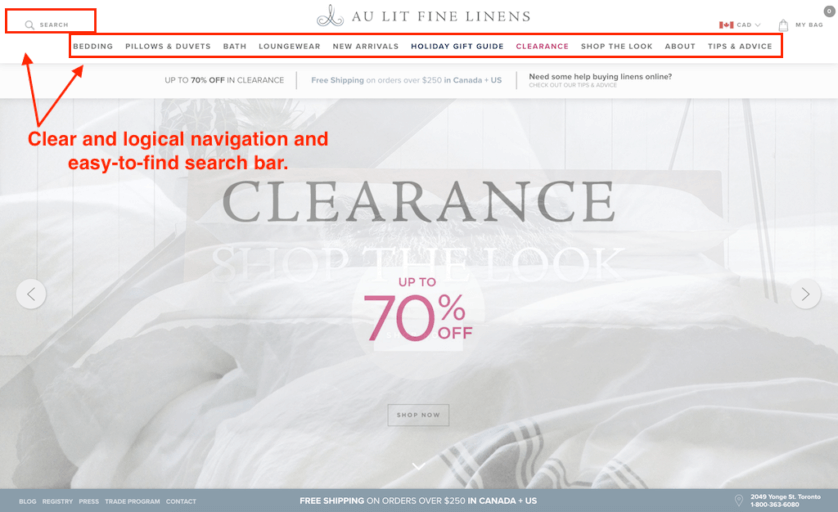
Who does it well: Au Lit Fine Linens
Be Responsive
It’s not enough to have a homepage that looks great on a desktop. In today’s day and age, your website must be optimized for every type of device. A 2016 study by Hitwise saw mobile search made up approximately 58% of search queries — which means a significant portion of your traffic is coming from mobile devices.
But optimizing your homepage for mobile means more than just making sure your design fits the screen dimensions — it means the entire experience needs to be user-friendly for mobile users.
Your mobile homepage should be rid of anything that makes it cumbersome to navigate and use your site (like annoying pop-ups that are hard to close on a small screen). It should also load quickly and feature clear and simple navigation.
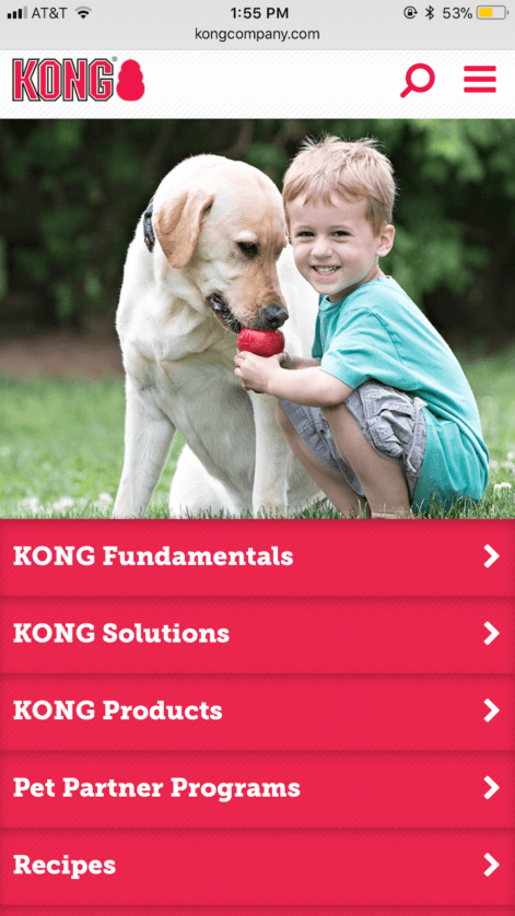
Who does it well: Kong Company
Tell People What to Do Next
If users get stuck on your homepage, it’s not doing its job. The page should be logical — which means it should have primary and secondary calls-to-action (CTAs) that help your users take the best next step depending on what they came to do.
Your primary CTA (the main action you want users to take) should be “above the fold”, which is web designer jargon for “above where the page cuts off and a user has to scroll down”. Your secondary CTAs can sit lower on the page.
Keep in mind that while you don’t want users hanging out on your homepage forever, that doesn’t mean you should go into CTA overload. Stick to a few actions that your audience may want to take and make sure you cover all stages of someone’s “journey” with you (i.e. have an action for those who are ready to convert, and one for those who are simply looking to learn more about you).
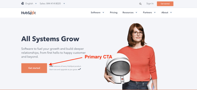
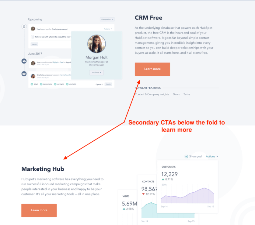
Who does it well: HubSpot
Extra Inspiration
Need extra inspiration? Here are three more examples of homepages that hit it out of the park:
Design and User Experience
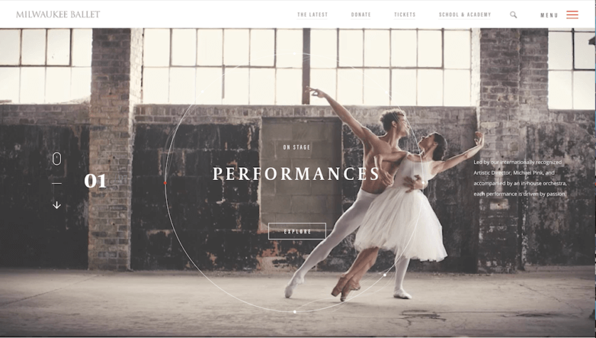
The Milwaukee Ballet homepage immediately catches the eye with a beautiful video of dancers performing. The entire homepage hero slideshow is video, but it doesn’t overwhelm. In fact, it hits just the right vibe a ballet-lover would love: elegant, sophisticated, and fluid.
But perhaps the best part of this homepage is that the user experience doesn’t take a backseat to the design. The navigation is easy to find and use (search bar included), and the CTAs over the video slideshow are logical and clear.
Clear Value Proposition
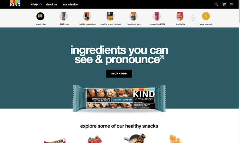
KIND Snacks gets full marks for its amazing tagline and value proposition. A visitor immediately understands what sets KIND apart as soon as they land on the homepage. Plus, the use of contrasting colors makes the whole page pop and immediately draws your eye to the product photo and tagline. Speaking of product photos… the KIND bar photo and secondary CTA photos are the level of quality homepage designers should be looking for. They do a great job of making the snacks look ultra-appealing.
Less is More
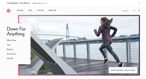
Remember that your homepage doesn’t need to be all things for your website. In fact, it needs to be one thing — the gateway to the rest of your site. Sometimes this means less is more, as is the case with Lululemon.
This minimalist homepage balances bold photos and colors with a clean design and straightforward navigation. There’s no doubt about what actions a user with a specific goal should take. Lululemon covers everything from trends to different clothing categories and gifts. They also do a great job of throwing in a value proposition at the top of their site to help reassure uncertain buyers: free shipping and free returns.
Conclusion & Next Steps
A great homepage draws in visitors and then keeps them on your site. This means the focus of your homepage shouldn’t be just a cool design — it should be on clearly communicating your value and next steps to your audience.
But keep in mind your homepage isn’t set in stone. In fact, it shouldn’t be! Your homepage should always be fresh to keep users engaged.
To be sure your homepage is delivering, keep an eye on how it performs in Analytics. Look especially at the Bounce Rate to determine if people are leaving immediately after landing there. If the bounce rate is high, it could mean visitors can’t find what they’re looking for, or you haven’t sold them on your value proposition.
Most importantly, be flexible! If you think something isn’t working, hop in there and fix it. In fact, try that now. Head over to your homepage and identify one thing you could change, and do it.
Related Articles
- How to Build a Minimally Viable Website
- 404 Page Best Practices, Ideas, & Examples
- Contact Us Page Best Practices, Ideas & Examples
- Ecommerce Product Page Best Practices, Ideas, & Examples
- Effective About Us Page Design: Best Practices & Examples
- FAQ Page Best Practices, Ideas & Examples
- Website Design Best Practices w/ Examples
- How To Design a Website Layout w/ Best Practices & Examples
- Thank You Page Best Practices, Ideas & Examples
- What Is A Web Design Color Palette and How Do I Make One?
- How Much Is A Website Per Year Explained
- 59+ Ways To Find Free Images For Commercial Use
- How to Improve Your Website Content
- How To Write A Meta Description For SEO
- How To Write A Title Tag For SEO
- Landing Page Best Practices w/ Ideas & Examples